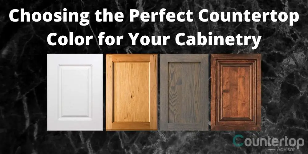
Choosing a countertop color to match your cabinets comes down to three decisions: match the undertone temperature (warm cabinets want a warm-toned counter, cool with cool), choose between contrast or blend (light-on-dark for drama, similar tones for calm), and test the samples in your actual kitchen lighting before you commit. After 10 years helping customers pick countertops, I’ve watched the same mistakes repeat — and they’re all avoidable. Here’s how to pair a countertop with white, gray, maple, oak, cherry, and the trending green cabinets, plus the three rules that prevent regret.
The 3 Rules That Prevent Color Regret
1. Match the Undertone Temperature
Every cabinet color reads either warm (yellow, red, orange base) or cool (blue, gray, green base). The single most reliable way to get a cohesive kitchen is to keep the countertop’s base tone in the same temperature family. A warm cherry cabinet with a cool blue-gray granite will fight each other; a warm cherry cabinet with a warm cream-and-gold granite will harmonize. Quick test: hold a sheet of pure white paper next to your cabinet sample — against true white, the cabinet’s warm or cool undertone becomes obvious. This undertone-matching principle is grounded in basic color theory.
2. Decide: Contrast or Blend
Contrast pairs light with dark — white cabinets with a dark counter, or dark cabinets with a pale counter. It creates drama, visual interest, and a modern look. Blend keeps cabinets and countertop in similar tones for a uniform, calming, seamless aesthetic. Neither is wrong; decide which you want before you shop, because it changes everything.
3. Test in Your Real Lighting
This is the most-skipped step and the source of the most regret. Showroom lighting is bright and flattering. Your kitchen’s lighting — the number of windows, the bulb color, the time of day — can make the same slab look completely different. A dark granite that looks rich in a sun-drenched showroom can read as a black hole in a kitchen with two small windows. Always bring samples home and look at them on the actual cabinets, in daylight and under your kitchen bulbs, before deciding.
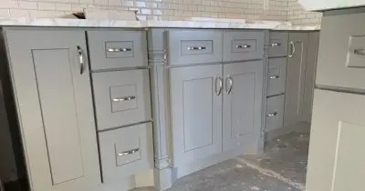
Countertop Colors for White Cabinets
White cabinets are the most flexible canvas — they work with nearly any countertop. Your options:
White or light counters create a soft, bright, monochromatic look — airy and timeless, though it needs texture (veining, a wood floor, a colored backsplash) to avoid feeling flat. Black or dark counters create crisp, modern, high-contrast drama. Gray counters give a calm contemporary look. Warm-toned counters (cream, gold, soft brown) warm up white cabinets for a more traditional feel. For the deep dive, see my guide to granite colors that pair with white cabinets.
Countertop Colors for Gray Cabinets
Gray cabinets are cool-toned, so cool-toned counters blend naturally. White counters with gray veining are the safest, brightest pairing. Darker gray or charcoal counters create a sophisticated tonal blend. Black counters deliver high contrast. Be cautious with warm-toned counters — a warm gold-brown granite can clash with cool gray cabinets and make the kitchen feel muddy. If you want warmth with gray cabinets, get it from the floor or hardware, not the countertop.
Countertop Colors for Maple Cabinets
Maple cabinets are light with a subtle warm undertone. They pair well with warm-neutral counters — cream, beige, light brown, or a warm-toned granite with gold and brown movement. Darker counters (deep brown, black) create contrast that frames the light cabinets nicely. Avoid stark cool-gray counters, which can make warm maple look dated and yellow by comparison.
Countertop Colors for Oak Cabinets
Oak — especially the honey-toned golden oak common in older kitchens — is strongly warm. The reliable counter pairings are warm browns, creams, and tans, and warm-toned granites with brown and gold movement. Black counters work for contrast. The challenge with golden oak is that cool grays and stark whites emphasize the orange in the wood; if your goal is to modernize an oak kitchen on a budget, a warm-but-neutral counter (and possibly painting or refinishing the cabinets) is the move. See my guide on wall colors for oak cabinet kitchens.
Countertop Colors for Cherry Cabinets
Cherry is a rich, warm, reddish-brown wood — one of the most dramatic cabinet colors. It pairs best with counters that have enough presence to hold their own: cream and beige with bold movement, black or very dark counters for a luxe contrast, or warm-toned granites with gold, cream, and black. Avoid busy multi-color counters that compete with cherry’s already-strong color — the cabinet and the counter both being loud creates visual chaos. Let cherry be the star and choose a counter that frames it.
Countertop Colors for Green Cabinets (2026 Trend)
Green cabinets — especially sage, olive, and deeper forest tones — are one of the strongest 2026 cabinet trends, a pairing highlighted across 2026 cabinet-and-countertop trend reports. They pair beautifully with white and cream counters for a grounded, nature-inspired, organic-modern look, and with warm-veined marble-look counters for an elevated version of the same. Concrete-look and soft-gray counters also work. Green cabinets read as a warm-leaning neutral, so they’re more flexible than they sound — the white-counter pairing is nearly foolproof.
Coordinating Accent Colors
Once cabinets and counter are set, the backsplash, wall paint, hardware, and flooring should support the pairing, not compete with it. Pull accent colors from the countertop — if your granite has a fleck of blue, a blue accent somewhere in the room ties it together. Keep the busy-vs-calm rule in mind: if both cabinets and counter are visually busy, keep the backsplash and walls quiet. If both are calm, the backsplash can be the statement. See my backsplash materials and trends guide for that decision.
Frequently Asked Questions
Should countertops be lighter or darker than cabinets?
Either works — it’s a style choice. Lighter counter over darker cabinets, or darker counter over lighter cabinets, both create attractive contrast. Similar tones create a calm blended look. What matters more than light-vs-dark is matching the undertone temperature (warm with warm, cool with cool).
What countertop color goes with everything?
White and light-gray counters with subtle veining are the most universally flexible — they pair with white, gray, green, and most wood cabinets. They’re the safe choice when you’re unsure or planning to sell, because they don’t lock the kitchen into a specific look.
How do I match a countertop to warm wood cabinets?
Keep the counter in the warm family — cream, beige, tan, or a granite with gold and brown movement. Avoid cool stark grays and bright cool whites, which fight warm wood and can emphasize an orange or yellow cast in oak and maple.
Why does my countertop look different at home than in the showroom?
Lighting. Showrooms are brightly and flatteringly lit; your kitchen has a specific number of windows and a specific bulb color. The same slab can look noticeably different. Always test samples in your actual kitchen, in both daylight and evening light, before committing.
Can cabinets and countertops be the same color?
Yes — a tonal, blended look (similar cabinet and counter tones) is calming and contemporary, and is a deliberate design choice. The risk is a kitchen that feels flat, so add interest through texture: a veined counter, a tile backsplash, varied hardware finishes, or a wood floor.
For more, see my guides on popular granite colors and granite pros and cons.
For the thickness, depth, and material differences specifically between kitchens and bathrooms, see kitchen vs bathroom countertops.